Note: The “bad” visualization is notably not in the report
Part One: Identifying Bad Visualizations
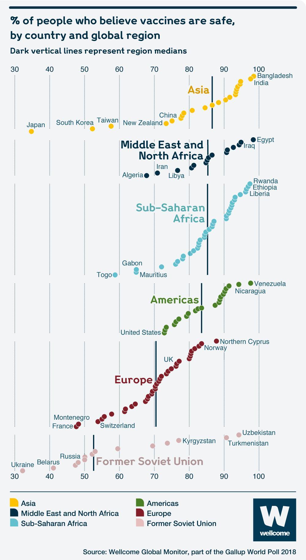
Story of the Graph: This graph is showing that different countries have different proportions of individuals who believe that vaccines are safe. While most of the region medians fall around 85, the median percentage is considerably lower for Europe and the Former Soviet Union.
Variables: We have region, country, and percentage of country that believes vaccines are safe.
Aesthetics: x-axis: percentage of people who believe vaccines are safe, color: global region, “y-axis:” region (to produce the stacking).
Kind of Graph: Geom_point; a dotplot
What I Would Change:
The points are trending upwards for seemingly no reason, which is misleading. I would do a boxplot or a density plot in order to better convey the message of the distributions within the regions.
If we’re trying to look at general trends between regions, it doesn’t make sense to label individual countries. I will remove these.
There is no reason to re-label the regions. I will remove the legend.
library(readxl)
library(tidyverse)
library(ggrepel)
library(leaflet)
library(rnaturalearth)
library(plotly)
country_data <- read_excel(
here::here("data", "wgm2018-dataset-crosstabs-all-countries.xlsx"),
sheet = "Full dataset")
country_data_dictionary <- read_excel(
here::here("data", "wgm2018-dataset-crosstabs-all-countries.xlsx"),
sheet = "Data dictionary")dictionary_firstrow <- head(country_data_dictionary, n = 1)
variable_codes_list <- as.list(str_split(dictionary_firstrow$`Variable Type & Codes*`, pattern = ","))
variable_codes_tibble <- tibble(Code = str_trim(variable_codes_list[[1]]))
coding <- variable_codes_tibble |>
filter(str_trim(Code) != "") |>
separate_wider_delim(Code, delim = "=", names_sep = "Country") |>
rename(WP5 = "CodeCountry1", Country = "CodeCountry2") |>
mutate(WP5 = as.numeric(WP5))final_dataset <- cleaned_dataset |>
group_by(Country, Regions_Report) |>
summarize(
prop_safe_belief = sum(Q25 %in% c(1, 2), na.rm = TRUE) / sum(!is.na(Q25)),
.groups = "drop"
) |>
mutate(true_region = case_when(
Regions_Report %in% c(3, 13) ~ "Middle East and North Africa",
Regions_Report %in% c(9, 10, 11, 12, 18) ~ "Asia",
Regions_Report %in% c(1, 2, 4, 5) ~ "Sub-Saharan Africa",
Regions_Report %in% c(6, 7, 8) ~ "Americas",
Regions_Report %in% c(15, 16, 17) ~ "Europe",
Regions_Report == 14 ~ "Former Soviet Union",
TRUE ~ "Not Assigned"
)) |>
filter(true_region != "Not Assigned",
!is.na(prop_safe_belief)) |>
mutate(prop_safe_belief_percent = prop_safe_belief * 100) ggplot(data = final_dataset,
mapping = aes(x = fct_reorder(true_region, prop_safe_belief_percent, .fun = median),
y = prop_safe_belief_percent,
color = true_region)) +
geom_boxplot(outlier.shape = NA, alpha = 0.3) +
geom_jitter(width = 0.05, alpha = 0.1, show.legend = FALSE) +
labs(
title = "Percent of People Who Believe Vaccines are Safe, \nby Country and Global Region",
subtitle = "Vertical Lines Represent Region Medians",
caption = "Source: Wellcome Global Monitor, part of the Gallup World Poll 2018") +
theme_minimal() +
theme(panel.grid.major.y = element_blank(),
panel.grid.minor.x = element_blank(),
panel.grid.major.x = element_line(color = "lightgrey",
linewidth = 0.3),
axis.title.y = element_blank(),
axis.title.x = element_blank(),
axis.ticks.x = element_blank(),
legend.position = "none",
plot.caption = element_text(size = 7, hjust = 1, face = "italic")) +
coord_flip(ylim = c(20, 100)) 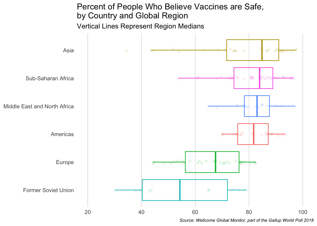
Part Two: Broad Visualization Improvement
Chart 3.3: Map of countries according to levels of Trust in Scientists (pg. 55)
Story of the Graph: Each country is supposed to display the amount of trust that a country has for scientists. It’s quite difficult to draw a lot of insights from this graph, but apparently we’re supposed to be able to recognize that countries with a lot of diversity tend to have a lot more trust in scientists.
Variables: Country, percentage of people who answered ‘high trust,’ percentage of ‘medium trust,’ and percentage of ‘low trust.’
Aesthetics: Shape: country, color: trust percentage
Kind of Graph: This is a heatmap
What I Would Change:
Apparently, they displayed three different variables on the graph, the percentage of those that answered ‘high trust,’ ‘medium trust,’ and ‘low trust.’ However, I’m not quite sure how they managed to display this, as it’s on a sliding scale from low to high, rather than percentage. Based on their analysis, I have a feeling that they either just used the “high,” or just displayed the WGM_index. But, I will make this more clear.
The country colors all look very similar to each other. I believe I should make the colors for “low trust” and “high trust” more distinct.
I think I should have an option to hover over the country and have it display its trust level. It’s difficult identifying which one has the largest trust.
final_dataset_2 <- cleaned_dataset |>
  group_by(Country) |>
  summarize(
    total = n(),
    prop_low_trust = (sum(WGM_Indexr == 1, na.rm = TRUE) / total) * 100,
    prop_med_trust = (sum(WGM_Indexr == 2, na.rm = TRUE) / total) * 100,
    prop_high_trust = (sum(WGM_Indexr == 3, na.rm = TRUE) / total) * 100,
    prop_no_opinion = (sum(WGM_Indexr == 99, na.rm = TRUE) / total) * 100,
    avg_trust = mean(WGM_Index, na.rm = TRUE),
    .groups = "drop"
  )
final_dataset_2 <- final_dataset_2 |>
mutate(Country = case_when(
Country == "United States" ~ "United States of America",
Country == "Czech Republic" ~ "Czechia",
Country == "Ivory Coast" ~ "Côte d'Ivoire",
Country == "Republic of Congo" ~ "Dem. Rep. Congo",
TRUE ~ Country
))
world <- ne_countries(scale = "medium", returnclass = "sf")
map_data <- world |>
left_join(final_dataset_2, by = c("name" = "Country")) |>
filter(name != "Antarctica") pal <- colorNumeric(
palette = "magma",
domain = c(1, 4),
reverse = TRUE,
na.color = "grey"
)
leaflet(data = map_data) |>
addTiles() |>
addPolygons(
fillColor = ~pal(avg_trust),
color = "white",
weight = 0.5,
fillOpacity = 0.8,
popup = ~paste0(
"<b>", name, "</b><br>",
"High Trust: ", round(prop_high_trust, 2), "%<br>",
"Medium Trust: ", round(prop_med_trust, 2), "%<br>",
"Low Trust: ", round(prop_low_trust, 2), "%<br>",
"No Opinion: ", round(prop_no_opinion, 2), "%<br>",
"Avg Science Trust Index: ", round(avg_trust, 2)
),
label = ~paste(name, "Average Trust in Science Index: ", round(avg_trust, 2))
) |>
addLegend(pal = pal, values = c(1, 4), title = "Average Trust in Science Index")Part Three: Third Data Visualization Improvement
Chart 3.8: Scatterplot exploring the relationship between a country’s life expectancy at birth and people who trust doctors and nurses (pg. 101)
Story of the Graph: This graph is trying to show that there is a positive relationship between the average life expectancy of a country, and how much they trust doctors and nurses. As one increases, the other does as well.
Variables: Country, average life expectancy, percentage of people who answered ‘a lot’ or ‘some.’
Aesthetics: y-axis: percentage of people who answered ‘a lot’ or ‘some,’ x-axis: average life expectancy, labels: country name
Kind of Graph: Geom_point; a scatterplot
What I Would Change:
The axes are quite hard to read and are not centered
While some countries are labeled for a reason, it appears as though most of the selected ones are arbitrary. I’ll try to add in a hover feature (which displays the country name and values) instead
final_dataset_3 <- cleaned_dataset |>
  group_by(Country) |>
  summarize(
    n_trust_medic = sum(Q11E %in% c(1,2), na.rm = TRUE),
    prop_trust_medic = sum(Q11E %in% c(1,2), na.rm = TRUE)/sum(!is.na(Q11E))
  )
life <- read_excel(
here::here("data", "Life.xls"),
skip = 3,
sheet = "Data")
life <- life |>
select(`Country Name`, `2018`)
final_dataset_3 <- life |>
left_join(final_dataset_3, by = c("Country Name" = "Country"))final_dataset_3 <- final_dataset_3 |>
filter(!is.na(prop_trust_medic))
fit <- lm(prop_trust_medic ~ `2018`, data = final_dataset_3) |> fitted.values()
plot <- plot_ly(
data = final_dataset_3,
x = ~`2018`,
y = ~prop_trust_medic * 100,
type = 'scatter',
mode = 'markers',
text = ~paste(
"Country: ", `Country Name`, "<br>",
"Proportion of Trust in Doctors and Nurses: ", round(prop_trust_medic * 100, 1), "%<br>",
"Life Expectancy: ", `2018`
),
hoverinfo = 'text',
marker = list(size = 10)
)
plot <- layout(
plot,
title = list(
text = "\nRelationship Between a Country’s Life Expectancy and its Trust in Medical Professionals\n ",
font = list(size = 15),
x = 0.07,
xanchor = "left"
),
xaxis = list(
title = "Life Expectancy at Birth (2018)",
dtick = 10
),
yaxis = list(
title = ""
)
)
plot